
Cartier 3D Virtual Try-On Application
Create an immersive online shopping experience from scratch

Time: Jun. - Aug. 2021
Role: UX / UI Designer, UX Researcher
Tool: Figma, FigJam, Photoshop
When the pandemic strikes
People’s desire to consume has decreased, yet online retail businesses thrived due to convenience.
In 2020, mainland China's luxury market reached around $53.5 billion, with a remarkable 150% growth in online sales. Recognizing the crisis as an opportunity, Cartier strategized to enhance its online ecosystem and omnichannel approach. This included expanding into China's lower-tier cities, targeting customers who lack easy access to physical luxury boutiques.

Initial Problem Scoping


Upon meeting with the stakeholders and doing a thorough investigation of the reason behind creating a virtual try-on application, my team clarified the business goals.
In order to create a seamless experience that can distinguish us from other luxury brands, the first question we have is how people shop for jewelry at a physical boutique. In other words, what is missing from the online experience?
Research
Contextual Inquiry
We observed 15 pairs of customers across four distinct locations and discovered that they place significant importance on product details, like materials and color. Customers less familiar with the brand or those shopping without a specific intent often seek recommendations from sales staff. A typical shopping experience usually includes multiple rounds of selection and switching. Ultimately, the essence of shopping revolves around evaluating the product's suitability: "Does it fit me?"
Competitive Analysis
Due to its beneficial effects on sales, AR technology has enhanced engagement for fashion and beauty brands investing in it. We examined four virtual try-on apps in the market, specifically focusing on hand and wrist products. Additionally, we explored three other types of competing applications to gain a more comprehensive understanding of general user flows and user interface design.
Despite the range of options available, we identified several issues:
Awkward Body Gesture: Using a cellphone camera to photograph a body part results in poses that are neither aesthetically pleasing nor comfortable.
Inaccurate Placement: Certain AR technologies are overly sensitive, causing the screen to flicker continuously, while others lack auto-placement features, necessitating manual adjustment.
Insufficient Information: The absence of basic product information renders the virtual try-on feature more akin to a game, hardly conducive to facilitating actual order placements.
Interview & Desk Research
We interviewed 10 general customers and conducted desktop research on social media posts and Cartier’s online store reviews. We wanted to learn how in-store try-ons helped customers evaluate jewelry, as well as their attitudes toward virtual try-ons.
Users have shown interest in using virtual try-ons, but they are concerned about the authenticity and realism of the experience.
Synthesizing Data


Research Outcome
· Try-on helps decide between similar products
· Try-on helps determine the size
· Try-on accelerates purchase
· Users care about the price
· Users may try on multiple items to pair up
· Users take photos to save references
Design Implication
· Allow users to compare products easily
· After trying, provide the link back to the online store
· Show product details during virtual try-on
· Allow for trying on multiple items within a limit
· Enable users to save virtual try-on results and share
How might we help customers better evaluate the products while shopping online so they can make purchase decisions wisely?
User Journey Map
Design Principles
Consistent
Consistent in information architecture & interactions with existing Cartier digital products.
Flexible
Enable users to try on products of various types and collections.
Accessible
Easy to use for people with different backgrounds and goals.
Fun
Convey the style of Cartier master design through the clear and elegant program.
Ideation & Challenges
Site Map
Based on our research findings and the client's requirements, we developed a site map that features two distinct entrances, allowing for a streamlined experience that guides users from their point of entry through the process of engaging with the camera function, experimenting with virtual try-on features, and finally, saving and sharing their selections. This structured approach ensures an intuitive and user-friendly interface that enhances engagement and facilitates ease of use.
Challenge 1: Gesture Guiding
To ensure a consistent experience, it's crucial to guarantee that gestures are easily recognizable and that jewelry accurately snaps into the correct position. Moreover, users should feel at ease when sharing images featuring these gestures.

Designated negative space for content and buttons, with a mirrored layout for ambidextrous use, ensures usability and accessibility.

Before try-on

During try-on
After try-on
Challenge 2: Product Categorization
Cartier's rich history has led to a vast array of collections, each featuring a diverse range of products. This extensive variety poses a significant challenge in effectively showcasing each item's unique attributes and conveying information efficiently.

How products are filtered
Cartier organizes products by type (e.g., rings, bracelets, watches) before grouping them into collections based on shared design concepts. Within each collection, there's a range of designs, such as shape and diamond paving. Products differing only by material are treated as variations of the same product, mirroring the approach of Cartier's official online store.

How products are organized visually
Challenge 3: Information Oranization
Understanding human factors and product categorization is crucial. The next step involves integrating this information intelligently to optimize space usage. We further refined our iterations based on several criteria:
Understandability: Ensuring information is straightforward.
Operability: Making interactions simple and intuitive.
Information Weight: Keeping content light and digestible.
Visual Aid: Using visual elements to enhance comprehension.
Accessible: Adhering to satisfying color contrasts and accessibility standards.
These principles guide the design process to create a user-friendly and efficient interface.
Option 1

Option 2

Option 3

Option 4
Usability Testing
Once we designed the primary screens for the user flow, we conducted a usability test using mid-fidelity mockups. Of the eight participants, most encountered difficulties during the virtual try-on phase. As indicated in the diagrams below, the visibility and effectiveness of some crucial call-to-action (CTA) buttons were inadequate. To resolve this, we need to refine the user interface, enhancing clarity and functionality to eliminate misunderstandings and ensure the features operate as intended.
Final Design
Entrance
Entrance A: Enter from the product detail page of the online store, where the product is already selected before accessing the virtual try-on mini-app.


Entrance B: Users access through a key visual banner or an external link for promotion purposes. Users will need to choose a product from the list to try on.
Camera
Getting users’ permission and giving users the freedom to choose between left and right hand.

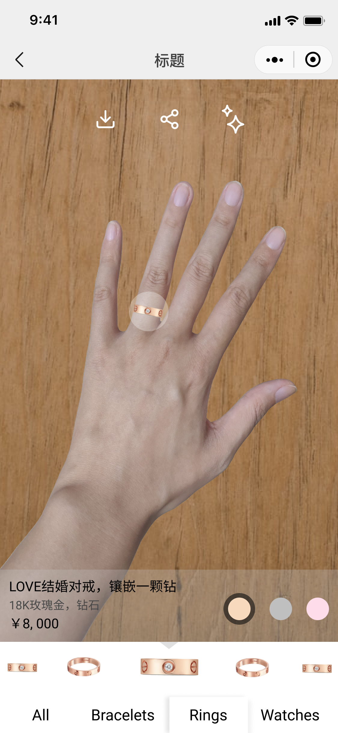
Virtual try-on
The key interfaces focus on three parts: essential functions, enhanced experience, and customization.

Change properties (texture/ colors)
Upon usability testing, We set the current product as the default selection. Displaying a picture of the metal with text is more user-friendly than merely having a button labeled "Properties."

Switch the selected product; adjust size and location
Users might find the auto-generated location for the product unsatisfactory or wish to try it on a different part of the body. Similar to other digital stickers, a virtual product should offer the ability to be scaled, rotated, and moved for a more customizable experience.
· Zoom in/ out
Users can zoom in and pan across the screen for product details
· Beautify
This is a highly requested feature by our stakeholders.
· Add on products
Users are able to add up to four products in one try.
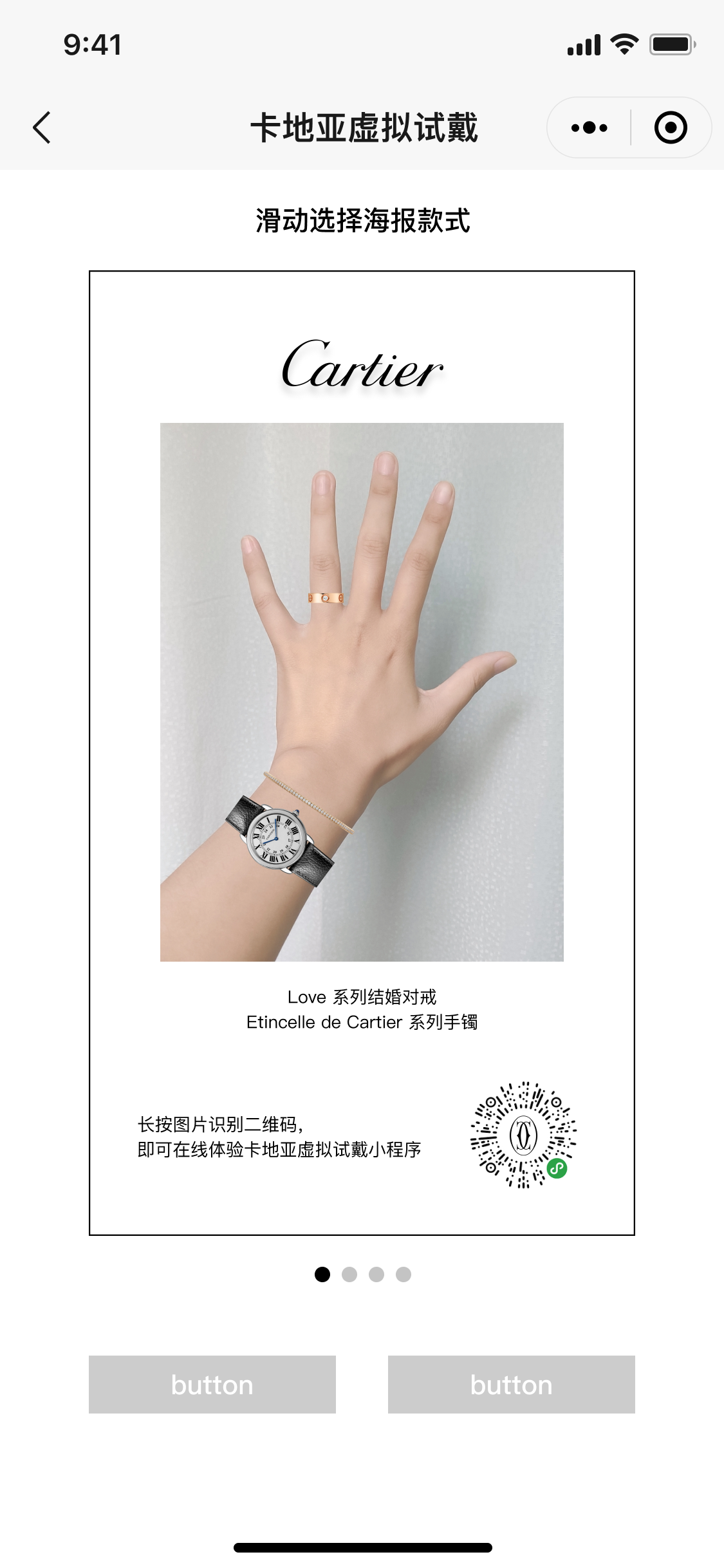
After completing their virtual try-on, users can save and share their experience using built-in templates with embedded QR codes. New users can easily access the app by scanning these QR codes.

Save and share

Project Outcome
We received favorable feedback from our client. Among the four project teams, our design was selected and successfully implemented in 2022.
“Your design consists of a lot of thoughtful details like allowing users to switch between left and right hands. This is very close to the product we expected. We will use this prototype as a valuable reference for our product development.”
- Jaret Zen, Senior Creative Technologist @ Cartier
This project offered valuable practical experience in client collaboration. As a designer, the requirements document was a crucial tool, and effective communication with the client was key to fully understanding the business objectives. This foundation allowed for the creation of a product that not only met but also enhanced user needs and goals.