DiDi Préstamos Pre-credit-approval Homepage Revamp
Reconstruct the information architecture and product benefit perception for a cash loan product through homepage redesign to boost conversion rates and user satisfaction
Time:
· April 2024 - August 2024
Tools:
· Sketch, Figma
Design Impact:
· Registration conversion rate increases by 10%
· Credit granting rate increases by 10%
Project Background
DiDi, one of the world's largest mobility service companies, offers financial services in Mexico through DiDi Préstamos, allowing drivers and users to apply for loans. Despite reaching 5 million loans by June 2023, the business faces challenges. Registration and credit approval conversion rates have been declining since early 2023, necessitating a revamp of the pre-credit approval process to enhance traffic reception and conversion efficiency. Additionally, the 2023 NPS survey revealed declines in user satisfaction regarding information disclosure and platform compliance. Since safety and reputation is crucial for financial products, optimizing these areas is essential to improve the overall user experience.

Understanding the Issue
In the early stages of international business's “rapid and wild” growth, the primary goals were to build a basic framework, deploy it quickly, and attract users through marketing strategies.
As the international sector expands, the driving force behind this redesign is to determine how DiDi Préstamos can better root itself in globalization while penetrating localization, and providing more users with reliable and trustworthy services in this new phase. Started by redesigning the homepage, as it serves as the first impression of the product.
What did the business data say?
Business data shows that while promotions like Cashback successfully drive traffic, they fail to sustain conversions, particularly for users accessing the homepage via resource slots, which have experienced a 50% drop in conversion despite their significant contribution to the credit user base. This highlights the need for clearer, consistent benefit communication on the homepage to boost registration and credit conversions. Furthermore, fixed configurations for credit limits and interest rates are limiting user engagement, as they fail to meet diverse loan needs. Unlike competitors offering customizable loan simulations, DiDi could benefit from more adaptable options, such as displaying estimated limits and gathering user loan requirements, to improve engagement and click-through rates.
What did our users say?
The NPS report indicates a decline in satisfaction levels compared to the previous period, particularly around the perceived reasonableness of loan fees, transparency of interest rates, and the effectiveness of repayment reminders. However, satisfaction with credit limits has improved.
Survey responses further highlight optimization opportunities, with users expressing concerns about security due to insufficient compliance and safety information. Adding these details could build trust and enhance conversions. Additionally, users found the product information on the homepage inadequate, seeking clearer explanations of key features for a better understanding. Lastly, seasonal themes were missing, with users suggesting that festive elements could improve engagement and boost conversions during peak periods.
What role does the homepage play?
Positioning of the pre-credit-approval home page
Design Explorations
After completing the analysis of the NPS report and survey, we gained a clear understanding of the homepage’s positioning. From there, we divided the design process into four key parts, beginning with restructuring the homepage and establishing an entirely new framework.
1. Framework Optimization
The goal was to highlight the product features, promote benefits, and build trust with users. The original structure lacked accessible security information, flexibility in loan options, and emotional elements like seasonal themes. To solve this, I organized the layout into ‘Understand’, ‘Operate’, ‘Attract’, and ‘Compliance’ sections.
Before
After
Starting from the top, the Security Module and User Center establish trust, while keeping the Core Financial Module in its original central position lowering the learning curve and keeping loan options easily accessible on the first screen. I added a Key Benefit Module to showcase promotions effectively, and positioned the FAQ and Product Introduction sections to provide clear product details and enhance transparency.
2. Visual Upgrade
Color
Mexico City, one of the most renowned ancient cities in the Americas, is famous for its architecture and graffiti, which share a common trait—pure, vibrant colors used boldly and with striking contrast. This conveys the passionate, optimistic spirit of Mexicans and their love for a free-spirited lifestyle. Feedback gathered locally shows that blue symbolizes trust and safety, aligning well with the tone of financial products, while orange represents enthusiasm and hope, providing a strong sense of brand identity.
Font Hierarchy Optimization
The previous design lacked a clear font hierarchy, with only 2pt spacing between levels, making it difficult to highlight key headings. The updated version doubles the spacing to 4pt, enhancing readability across content levels. Core numerical data is now displayed with a larger, bolder font and a new typeface, helping users quickly identify essential information.
Customizable Layers
The "customizable layers" section in this redesign introduces a flexible layout for the marketing-oriented homepage, created to meet the needs of the operations team. To accommodate diverse scenarios, facilitate rapid iterations, and attract users, the design focuses on customizable elements in the core header and first-screen area. Key components—such as “color themes”, a “dynamic marketing banner”, and a “background image” — are adaptable, allowing the team to easily modify these layers to fit various campaigns and seasonal promotions. This approach not only enhances visual appeal but also maximizes the homepage’s versatility for different marketing strategies.
3. Componentization
To adapt more flexibly to various marketing campaigns and facilitate data comparison for future A/B testing, we designed a series of marketing banners, highlighting the various users’ benefits. Based on different business needs, we allow for flexible stacking of components, ensuring both a cohesive design language and alignment with business requirements.
4. Emotional Design
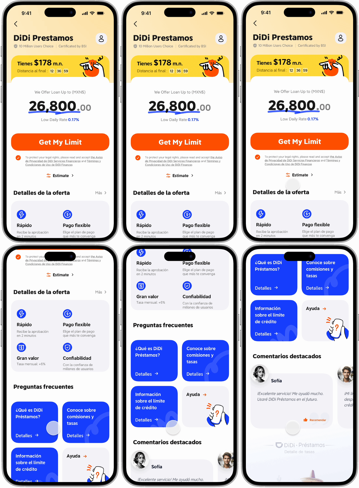
By default, we display a small portion of the graphic to spark users' curiosity while keeping the image recognizable. Users can scroll up to gradually reveal the entire sequence, which features a series of characters and scenes inspired by Mexican culture. The progression moves from a desert landscape with an agave plant in a sombrero to a Santa Claus figure and a skeleton in a mariachi outfit for Día de los Muertos. By incorporating familiar cultural icons in a fun, animated style with a festive atmosphere, this emotional design fosters a sense of cultural connection, celebration, and lightheartedness, building trust and relatability with users.
Final Design
In line with the business objectives and to identify the most effective design strategy, we developed four distinct versions for the revamp, each featuring a unique approach to the core financial module. This allows us to evaluate which design best meets user needs while driving engagement and conversions, data was collected through A/B testing.
Version One - Mian
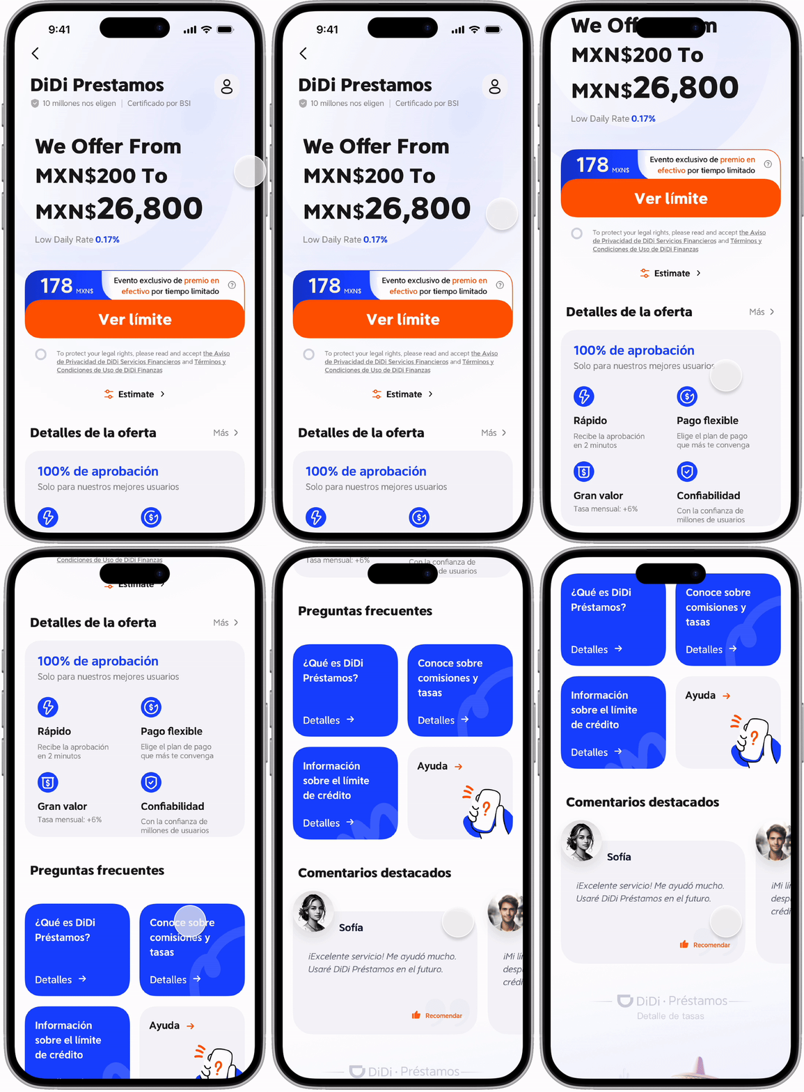
The main version presents a simpler display of the maximum and minimum loan amounts (MXN$200 to MXN$26,800) without an interactive slider. The emphasis here is on clarity and direct communication, which quickly informs users of the loan range available. Adding a ‘Estimate’ entrance at the bottom allows users to understand and set expetation about the payment plan. This design is more straightforward and appealing to users who are more need-driven, prioritize speed and simplicity over customization, reinforcing trust through transparent information display.
Version Two - Slider
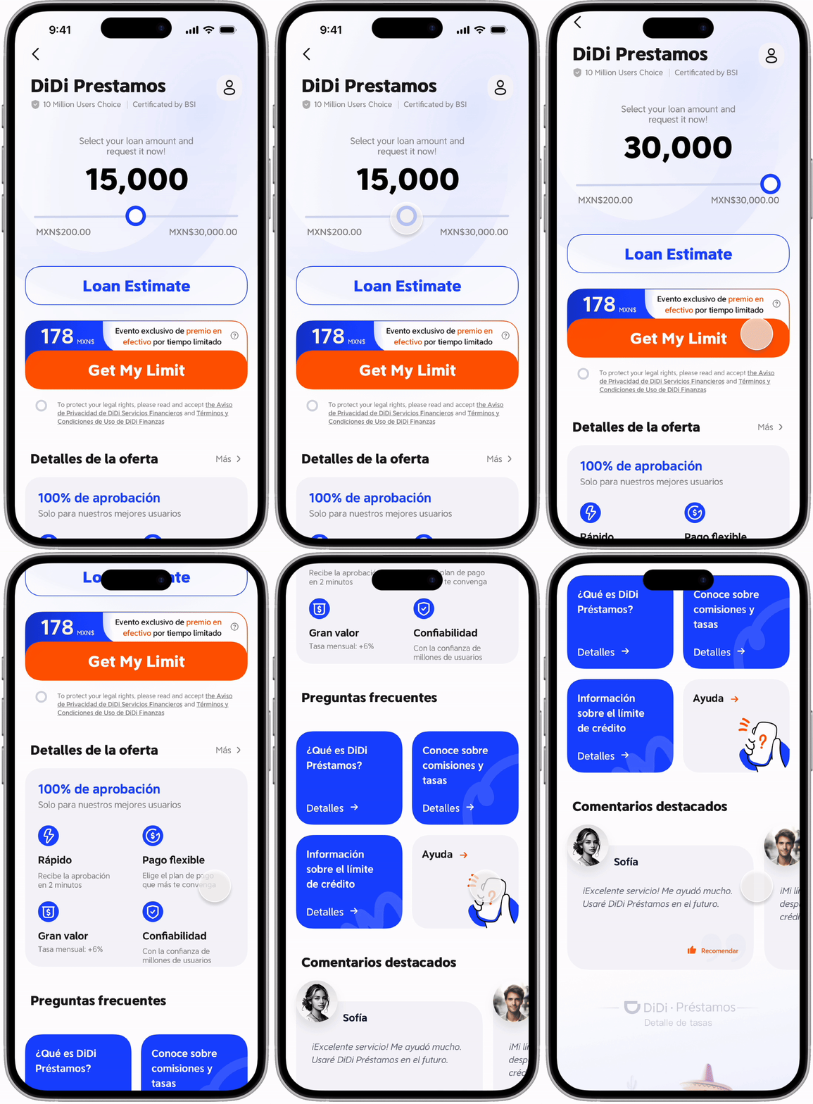
In this version, the core financial module features an interactive loan slider, allowing users to adjust the loan amount they wish to request within the set range. This design encourages user engagement by providing a sense of control and customization, allowing users to choose a loan amount that fits their needs. The interactive slider makes the experience more dynamic, which can help reduce the perceived rigidity of the loan options and foster a sense of personalization.
Version Three - Tab
The core financial module in this version uses a tabbed design with options labeled "Request" and "Estimate." This tabbed structure allows users to switch between viewing their loan eligibility and calculating an estimated loan amount. The design adds flexibility for users who may not be ready to apply immediately but wish to explore their options. This approach caters to users who value transparency and prefer to explore details before making a decision, enhancing the information depth within the core module.
Version Four - Marketing/ Promotion
This version fulfills the operation team’s needs. The core financial module introduces a customizable promotional banner within the loan amount display, showing a limited-time reward for new loans. This design strategy leverages urgency and exclusivity to attract attention and motivate users to apply sooner. The combination of loan details with a special offer increases the appeal of the loan product, especially for users who are influenced by promotions, adding a layer of incentive to the core financial information.


