Xiaohongshu B2C Design System
Notes Components & Guidelines
Time: 2023.04 Tool: Figma Role: UX Designer Status: In-use
To streamline the design process for a platform with over 200 million monthly active users
With a mission to “inspire lives”, Xiaohongshu is a leading lifestyle platform that inspires people to discover, connect, and share a range of diverse lifestyles, such as cosmetics and beauty, fashion, food, travel, entertainment, reading, fitness, and childcare.
In order to enhance the efficiency and effectiveness of the C-end business operations while aligning with a visually lightweight design language, the UED team undertook the initiative of refining the Figma component library and establishing C-end design standards.
Deliverables
Due to our fast-paced product iterations, I assisted the team in rapidly generating essential core components using Auto Layout and Variants. I also authored specification documents to expedite core page development for our designers.
NNS (note-next-step) Guidelines
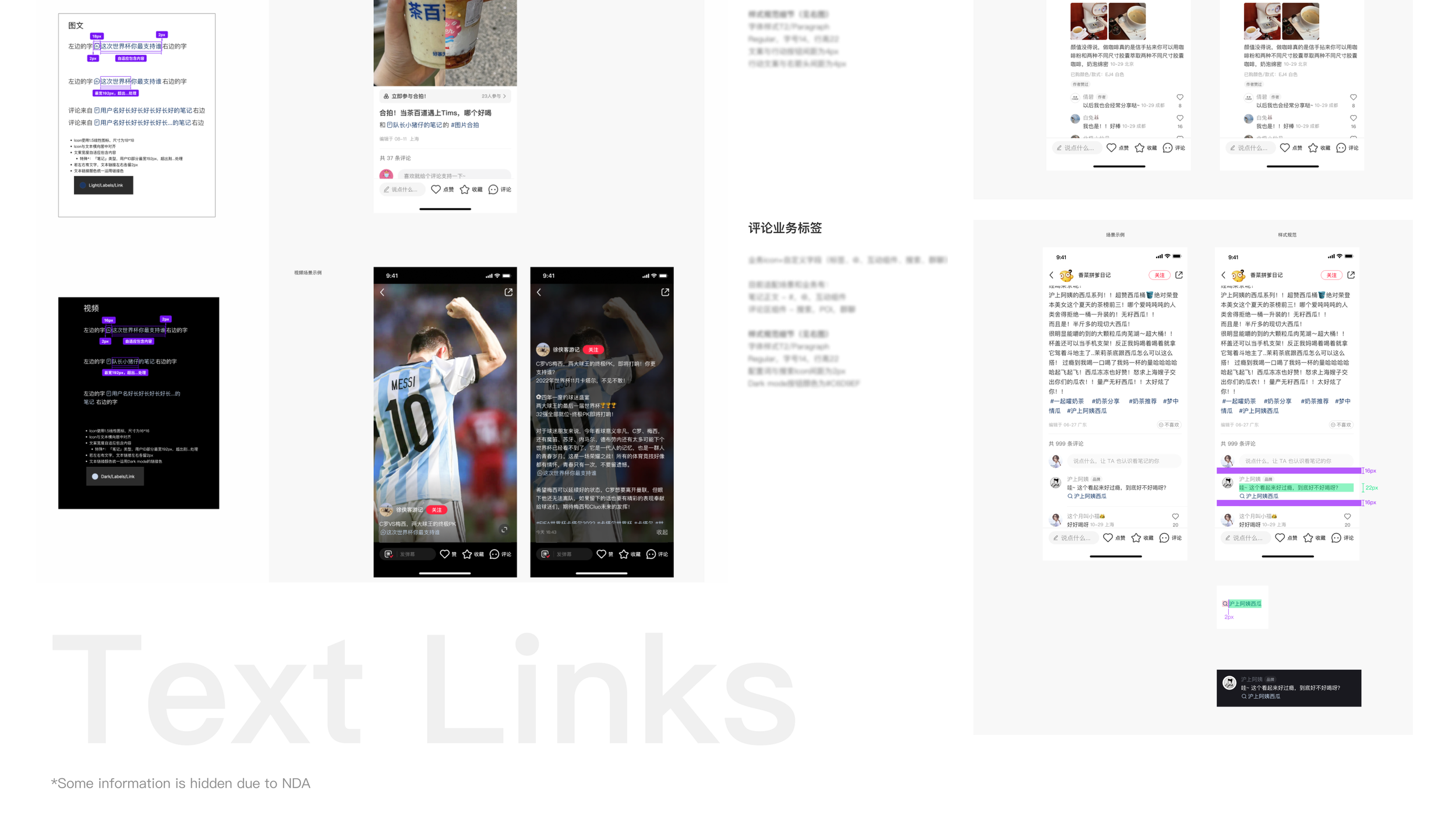
Text Links Guidelines
Engage Bar Guidelines
Solutions
As Xiaohongshu's most prominent interface, "Note" serves as a hub for user-generated content and essential business functions like boosting consumption, enabling content creation, and fostering user engagement. I extracted and repurposed interface elements into reusable components, covering text and video content scenarios for both light and dark modes. I also delivered concise documentation outlining component styles, business adaptability, and font guidelines to ensure cohesive and user-friendly design.
Design Principles
Accessibility
Design for All
Simplicity
Less is More
Hierarchy
Hierarchy of Information
Flexibility
Flexible and Smooth
Design Process
A good design system is never static, instead, it needs to quickly adapt to new business demands. Therefore, I prioritized scalability, anticipating future needs to ensure the design system remains adaptable and sustainable in the long run. I also worked closely with developers for technical feasibility, to ensure that these components can show up on new updates. This proactive approach guarantees that the design system remains responsive to the ever-changing needs of the business.
Business Scenarios
The Engage Bar, as a commonly used component that intuitively displays user interaction data, needs to integrate various interaction buttons, business functions, and data, and achieve multi-platform compatibility. This ensures that users can quickly adapt and operate flexibly on different devices.
Business Scenarios
The business scope of text links includes corner markers, action buttons, text links within the main body, and business tags in comments, among others. These elements are typically closely integrated with the main text or comment content, so they need to harmonize with other textual content while being designed to be easily recognizable, facilitating users to quickly navigate to related pages.
Business Scenarios
NNS (Note Nest Step) is a crucial component in the business scenarios of Xiaohongshu. It is typically superimposed over images or videos, thus the design must adhere to principles of simplicity and minimal space occupancy. By varying the shape and text content, along with copy that encourages clicking behavior, it draws user attention and motivates them to click, thereby enhancing conversion rates.
My Takeaways
Design systems provide crucial support to product teams and product ecosystems. They require regular maintenance, in-depth familiarity with the standards, and widespread usage to reap their full benefits.
Creating a component library demands meticulous attention to every detail, listing adaptation specifics for all scenarios while accommodating design requirements for both iOS and Android. This approach ultimately enhances team efficiency.
Building a component library isn't merely assembling existing designs; it's a process where designers summarize, identify gaps, and produce a design language that is easy to implement, reusable, and aligns with various business needs.


